A dictionary of motion in pure CSS
Ninety-eight verbs of motion, each animation built to embody its definition. A note on the one repeated pattern that makes the whole thing tick — per-character spans, a --i index variable, and staggered CSS keyframes.
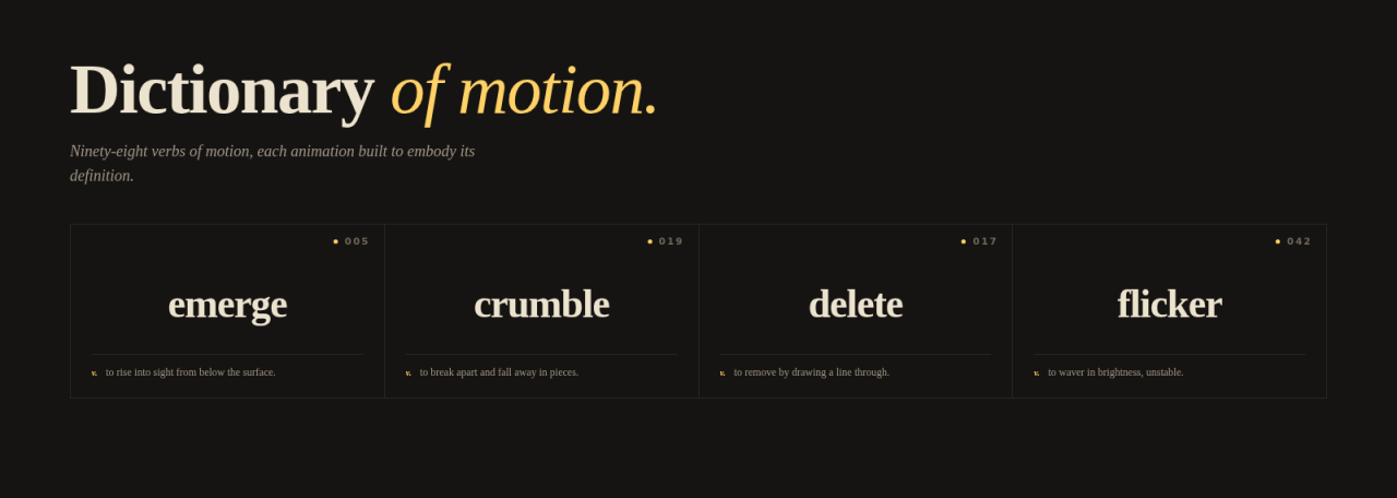
Four entries from the dictionary.
Setting up the question
I was riffing with Claude on what pure-CSS typographic animation could be. We kept circling the same idea: words on a page are static. Type sits there like blocks. Headlines arrive and stay. The word "shimmer" doesn't shimmer. What would happen if every word's motion was actually its definition?
That premise turned out to be productive enough to sustain a small dictionary of words about motion, where each entry is also a working demo. Hover "crumble" and it crumbles. Hover "delete" and a strike line draws through it and the characters fade out. Ninety-eight verbs of motion, every one of them earning its place.
The whole thing is up in the lab. This is a note on how it works.
One pattern, repeated
Every entry is the same shape:
- A
.wordspan containing a single verb. - A bit of JS that splits the text into per-character
.charspans and sets a CSS custom property on each. - A
@keyframesanimation that staggers off that property.
That's the entire engine. No animation library, no Web Animations API, no spring physics. Plain CSS keyframes plus one custom property for the per-character delay:
document.querySelectorAll('.word').forEach(word => {
  const text = word.textContent;
  word.textContent = '';
  [...text].forEach((ch, i) => {
    const span = document.createElement('span');
    span.className = 'char';
    span.textContent = ch;
    span.style.setProperty('--i', i);
    word.appendChild(span);
  });
});
Once --i exists on every character, every keyframe rule gets a stagger essentially for free:
.word:hover .char {
  animation: bloom 1.2s cubic-bezier(.16, .87, .34, 1)
             calc(var(--i) * 60ms) both;
}
The first batch is obvious. glide slides left to right. fade fades. type reveals characters one at a time. After ten or so, the easy ones run out.
Where it gets interesting
crumble is the one I keep coming back to. Each character has to fall, but the rotation has to be random per character — otherwise the pile is choreographed instead of chaotic.
So the JS also plants a second custom property on each char, a per-character random number between 0 and 1:
span.style.setProperty('--rand', Math.random().toFixed(3));--rand is the only randomness in the whole demo and it carries a lot of weight. Here it is in the crumble keyframes:
.word[data-v="crumble"]:hover .char {
  animation: crumble 1.5s cubic-bezier(.5, 0, .7, .5)
             calc(var(--rand) * 200ms) both;
}
@keyframes crumble {
  0%   { transform: translateY(0) rotate(0);
         opacity: 1; }
  50%  { transform: translateY(20px)
                    rotate(calc((var(--rand) - .5) * 80deg));
         opacity: .7; }
  100% { transform: translateY(140px)
                    rotate(calc((var(--rand) - .5) * 200deg));
         opacity: 0; filter: blur(2px); }
}
The (var(--rand) - .5) centers the random value around zero, so half the characters rotate left and half rotate right. Without it you get a pile that all leans one way.
delete took the most back-and-forth. The definition is to remove by drawing a line through. So the per-character animation has to do two things in sequence: a strike line drawn left to right, then a fadeout. Each character gets a pseudo-element for the line:
.word[data-v="delete"] .char {
  position: relative;
}
.word[data-v="delete"] .char::after {
  content: ""; position: absolute;
  left: -2px; right: 100%; top: 50%;
  height: 3px; background: var(--accent);
}
.word[data-v="delete"]:hover .char::after {
  animation: deleteLine 1.4s cubic-bezier(.7, 0, .3, 1) forwards;
}
@keyframes deleteLine {
  0%   { right: 100%;  opacity: 1; }
  50%  { right: -2px;  opacity: 1; }
  100% { right: -2px;  opacity: 0; }
}
The line grows from zero to full width by animating right from 100% to -2px. It holds at full width through the middle of the timeline, then fades. The character itself fades on a slower curve so the strike completes before the word leaves the page.
Auto-play on scroll
I didn't want hover to be the only way to see an entry play — the reference is more useful if things move once as you scroll past them. One IntersectionObserver does the whole job:
const io = new IntersectionObserver(entries => {
  for (const e of entries) {
    if (!e.isIntersecting) continue;
    e.target.classList.add('playing');
    setTimeout(() => e.target.classList.remove('playing'), 2000);
    io.unobserve(e.target);
  }
}, { threshold: 0.45 });
Two seconds covers most of the one-shot animations cleanly; a couple of the longer ones gently clip at the end, which I'd rather accept than make every entry sit on screen for three or four seconds. Adding .playing triggers the same animation rule that :hover uses, with a shared selector:
.word[data-v="bloom"]:hover .char,
.word[data-v="bloom"].playing .char { /* … */ }
unobserve after the first hit means each entry plays once on its way past. Hover is for replay.
What it ended up being
We expected maybe a dozen entries. The list kept growing because the constraint — the animation has to be the definition — turned out to be productive. By the time it stopped expanding, it was at 98 across 13 categories: appear, decay, spring, continuous, impact, distort, travel, state, light, sound, mechanical, trail, glitch.
It now sits in the lab, which seemed like the right home. Not portfolio. Not a blog post on its own. A page to bookmark when you need to remember what precipitate could mean visually, or to fork an animation for your own project.
A note on the AI part
Both the dictionary and this post were built with Claude. My job was setting the constraint, picking which entries felt worth keeping, and pushing back when an animation didn't quite match its definition. Claude's job was generating candidate keyframes fast — usually three or four variants per word, of which one would survive untouched, one or two would get rewritten, and the rest got thrown out.
The pattern that made this useful: the task is constrained (one word, one keyframe block, one definition to honor), repetitive (98 entries follow the same recipe), and visual enough that I could glance at the result and immediately know whether it was right. That's the shape of work AI is unreasonably good at right now. Open-ended creative direction is still on me. The 90% of the work that's applying the direction once it exists, much less so.
Hover any entry. Or scroll. Or filter by name.