Figma to working app, never editing the code
A self-imposed rule (don't edit the code, push past the brief), a Figma design from Frontend Mentor, and two terse prompts. The first push gave me 146 lines of clamp-everywhere fluid CSS with zero hard-coded pixels. The second turned it into a working QR generator. Notes on what the rule actually produces.
I gave Claude a Figma design, two terse prompts, and one self-imposed rule: I don't touch the code. Push it past the brief. This is what came out.
I've started running a small ongoing experiment: I take Frontend Mentor design challenges and use them to develop my workflow for going from Figma to working code with Claude. The challenges are deliberate training material — known scope, real designs, easy to repeat. I'm planning to move up the difficulty ladder over time.
But there's a rule that makes this useful rather than just "watch the AI build a thing":
I don't edit the code myself. If something is wrong, the prompt was wrong — fix the prompt, not the file.
Why? If I patch the output, I stop being able to tell what good prompting looks like — I just see my own fixes. So the rule keeps the feedback honest, and forces me to do the harder work: figuring out why something is off so I can re-prompt it.
The first challenge was a QR code component — a single static card, the simplest thing Frontend Mentor offers. I picked it on purpose. I didn't want the brief to absorb my attention; I wanted to see what happened when I added my own constraints on top of a trivial design.
Push #1: the brief, plus one constraint
Frontend Mentor says: build this card to match the Figma at the two breakpoints (375px mobile, 1440px desktop). The card is 320px wide in both views. Most implementations stop at translating the Figma's pixel values directly into the stylesheet — which is what the brief asks for. I wanted to add a constraint on top.
I gave Claude the Figma and added a constraint:
make code responsive, don't ever use fixed pixels. use clamp and fluid typography and spacing but should match the size on figma brakepoints
That's the whole prompt. Five lines, one typo, no polish.
Claude's reasoning trace before writing any code:
Let me think about the fluidity carefully: card width 320px is identical at both breakpoints in Figma — so it stays fixed at 320px conceptually, but I should make it fluid to fit smaller viewports. Internal proportions (padding 16px, gap 24px, bottom padding 40px, QR 288px, text 22px/15px) are also fixed in Figma. For true fluidity, I'll scale using clamp between a minimum (narrow phones ~320px viewport) and the Figma size, with an upper cap that can go slightly larger on big screens.
Then it produced this:
:root {
  /* Card grows from narrow phones to large monitors, but parks
     near the 320px Figma reference across the design range. */
  --card-w: clamp(18rem, 16rem + 4vw, 22rem);

  /* Everything else is a fraction of --card-w so the whole card
     scales as one system. */
  --card-radius: calc(var(--card-w) * 20 / 320);
  --card-pad-x:  calc(var(--card-w) * 16 / 320);
  --card-pad-b:  calc(var(--card-w) * 40 / 320);
  --card-gap:    calc(var(--card-w) * 24 / 320);
  --title-size:  calc(var(--card-w) * 22 / 320);
  --body-size:   calc(var(--card-w) * 15 / 320);
  /* …all metrics derived this way. */
}
146 lines of HTML + CSS. Zero hard-coded pixels. Every padding, type size, and corner radius is a function of --card-w. The card scales as one unit instead of breaking apart at intermediate viewports.
The prompt worked for two reasons. First, "don't use fixed pixels" is precise — it closes off an entire family of solutions where "make it more responsive" would have produced something vaguer. "Responsive" is a category; "no fixed pixels" is a behaviour. Second, the constraint goes beyond what the brief asks. The brief specifies two breakpoints and stops — a fidelity test, not a how-should-you-build-it guide. Following it literally gives you a card that's correct at 375 and 1440 and awkward at every viewport in between. Adding my own constraint on top is the part that makes this useful instead of just an exercise.
The output: a card that holds its proportions whether you're on a 320px phone, a 768px iPad, or a 2560px monitor. None of those viewports are in the Figma. They didn't need to be.
Push #2: turn it into something that actually does something
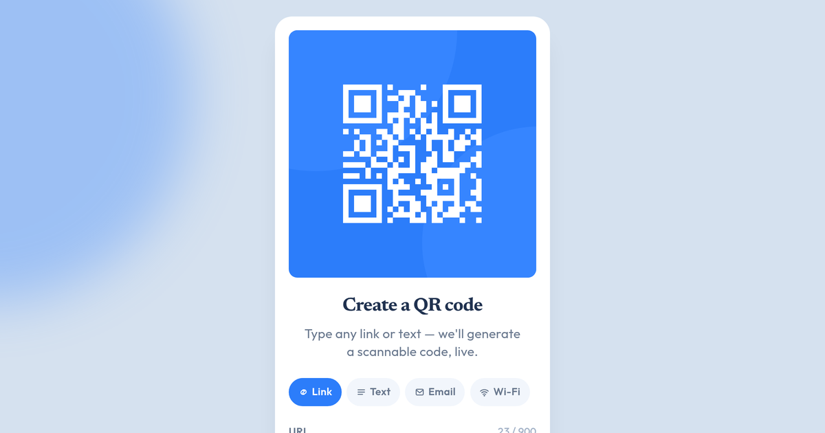
A static card with a static QR pointing at frontendmentor.io is a Figma challenge, not a product. The natural next push:
this is quite good. keep this version, copy it and create a real dynamic version where qr code is generated from the text that user entered. keep colors and these round overlays/shadows. figure out the best ux for text field and process. turn it into a qr generator web app
Three lines of direction. Notice what I didn't specify:
- The library. Claude picked
qrcode-generator@1.4.4— tiny, well-known, returns a boolean module grid you can render however you want. Good call. I didn't have to think about it. - The UI pattern. Single card with two faces (input / result) that crossfade. Debounced live preview as you type. Preset chips (Link / Text / Email / Wi-Fi) that prefill templates. Error-correction segmented control. Copy-to-clipboard and PNG download. None of these were in my prompt — they came from the directive "figure out the best UX for text field and process."
- The rendering approach. Custom SVG path with one rect per dark module instead of using the library's built-in renderer, so the QR inherits the card's visual language (the same circle ornaments behind the QR appear in the rasterised PNG export, baked in on the canvas side).
The version it shipped does all of this in a single self-contained HTML file. The qrcode library is the only dependency. There's no React, no build step, no telemetry. You can fork the page and serve it from anywhere.
You can try it in the lab.
What the rule changes
A couple of things stand out a few challenges in.
The first is what I treat as a "bad result." With the rule on, a bad output isn't something I fix — it's something I diagnose. What was wrong with the prompt that produced it? That reflex is slower than reaching for the keyboard, but it compounds. The next prompt is better because I had to think about what "better" means in the moment.
The second is what kinds of prompts actually work. The precise ones do: "don't ever use fixed pixels" closes off a family of solutions and forces a real choice. The vague ones don't: "make it more responsive" produces something noticeably worse, because "responsive" is a category, not a constraint. The pattern that emerges: a usable AI prompt looks more like an acceptance criterion than a brief.
That's what I'm developing through these challenges — the muscle for writing those acceptance criteria, on the kinds of work where AI can credibly carry the implementation. The Frontend Mentor designs are training material for that.
What's next
This is the first in a series. The challenges will get harder — the next one is also a single-screen Figma, but with more interaction. Eventually I'll move to multi-screen designs, then to designs that aren't from Frontend Mentor at all (a real client-style brief). Same rule applies the whole way: don't edit the code, push past the brief.
If you want to follow along, the QR generator is the first lab artefact from this run. The post for the next challenge will go up when I've finished it.